Filtering results#
A simulation model might output a large number of performance measures. If you wish to have a graphical view of all measures you may find it infeasible to include individual plots. In these circumstances you may want a user to be able to select which measure is displayed on a single plot included in the app.
There are multiple ways to achieve this aim. Here we demonstrate using plotly itself rather than relying on creating your own logic within the streamlit script.
1. Imports#
import plotly.graph_objects as go
from model import Experiment, multiple_replications
2. plotly code#
To achieve our aims we must use plotly.graph_objects. A modified results histogram is implemented below in the function create_user_filtered_hist().
Note that the listing is specific for a histogram. If a different type of plot was needed then the code would need to be modified.
def create_user_filtered_hist(results):
    '''
    Create a plotly histogram that includes a drop down list that allows a user
    to select which KPI is displayed as a histogram

    Params:
    -------
    results: pd.Dataframe
        rows = replications, cols = KPIs

    Returns:
    -------
    plotly.figure

    Sources:
    ------
    The code in this function was parly adapted from two sources:
    1. https://stackoverflow.com/questions/59406167/plotly-how-to-filter-a-pandas-dataframe-using-a-dropdown-menu

    Thanks and credit to `vestland` the author of the reponse.

    2. https://plotly.com/python/dropdowns/
    '''
    # create a figure
    fig = go.Figure()

    # set up a trace
    fig.add_trace(go.Histogram(x=results[results.columns[0]]))

    buttons = []

    # create list of drop down items - KPIs
    # the params in the code would need to vary depending on the type of chart.
    # The histogram will show the first KPI by default
    for col in results.columns:
        buttons.append(dict(method='restyle',
                            label=col,
                            visible=True,
                            args=[{'x':[results[col]],
                                   'type':'histogram'}, [0]],
                            )
                      )

    # create update menu and parameters
    updatemenu = []
    your_menu = dict()
    updatemenu.append(your_menu)

    updatemenu[0]['buttons'] = buttons
    updatemenu[0]['direction'] = 'down'
    updatemenu[0]['showactive'] = True
    updatemenu[0]['x'] = 0.25
    updatemenu[0]['y'] = 1.1
    updatemenu[0]['xanchor'] = 'right'
    updatemenu[0]['yanchor'] = 'bottom'
    #updatemenu[0]['pad'] = {"r": 10, "t": 10}


    # add dropdown menus to the figure
    fig.update_layout(showlegend=False,
                      updatemenus=updatemenu)


    # add label for selecting performance measure
    fig.update_layout(
    annotations=[
        dict(text="Performance measure", x=0, xref="paper", y=1.25,
             yref="paper", align="left", showarrow=False)
    ])
    return fig
# code to create the histogram

default_exp = Experiment()
results = multiple_replications(default_exp, n_reps=100)
create_user_filtered_hist(results)
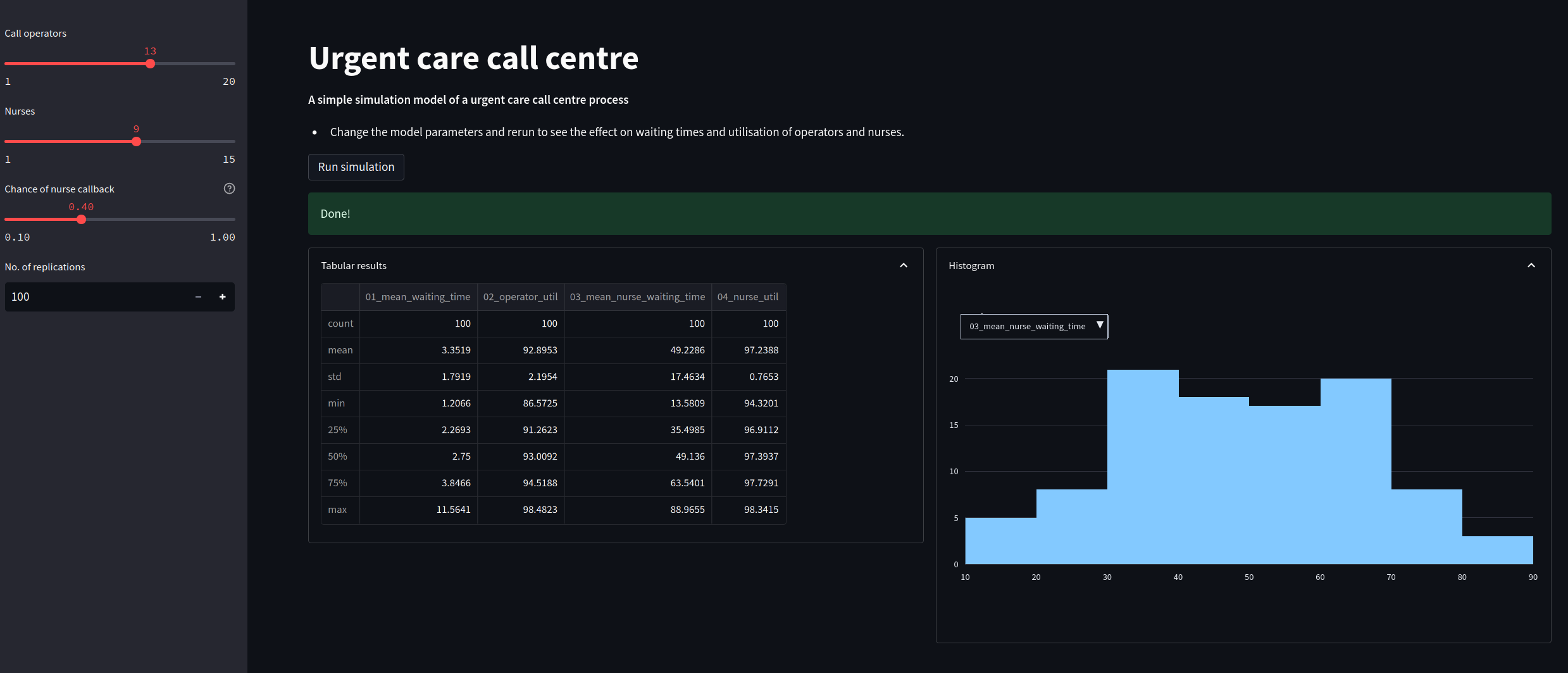
The listing below is a new module called app_with_filter.py. It updates our histogram code to allowing filtering of results. Underneath is a screenshot of the new web app.
"""
The code in this streamlit script adds in a plotly
chart to display a histogram of replications. The results shown in the
histogram can be selected by the user.
"""
import streamlit as st

#################################################################################
# MODIFICATION: import graph_objects instead of plotly.express
import plotly.graph_objects as go
#################################################################################
from model import Experiment, multiple_replications

INTRO_FILE = './resources/model_info.md'

def read_file_contents(file_name):
    ''''
    Read the contents of a file.

    Params:
    ------
    file_name: str
        Path to file.

    Returns:
    -------
    str
    '''
    with open(file_name) as f:
        return f.read()


###################################################################################
# MODIFICATION: user filtered chart
def create_user_filtered_hist(results):
    '''
    Create a plotly histogram that includes a drop down list that allows a user
    to select which KPI is displayed as a histogram

    Params:
    -------
    results: pd.Dataframe
        rows = replications, cols = KPIs

    Returns:
    -------
    plotly.figure

    Sources:
    ------
    The code in this function was parly adapted from two sources:
    1. https://stackoverflow.com/questions/59406167/plotly-how-to-filter-a-pandas-dataframe-using-a-dropdown-menu

    Thanks and credit to `vestland` the author of the reponse.

    2. https://plotly.com/python/dropdowns/
    '''
    # create a figure
    fig = go.Figure()

    # set up a trace
    fig.add_trace(go.Histogram(x=results[results.columns[0]]))

    buttons = []

    # create list of drop down items - KPIs
    # the params in the code would need to vary depending on the type of chart.
    # The histogram will show the first KPI by default
    for col in results.columns:
        buttons.append(dict(method='restyle',
                            label=col,
                            visible=True,
                            args=[{'x':[results[col]],
                                   'type':'histogram'}, [0]],
                            )
                      )

    # create update menu and parameters
    updatemenu = []
    your_menu = dict()
    updatemenu.append(your_menu)

    updatemenu[0]['buttons'] = buttons
    updatemenu[0]['direction'] = 'down'
    updatemenu[0]['showactive'] = True
    updatemenu[0]['x'] = 0.25
    updatemenu[0]['y'] = 1.1
    updatemenu[0]['xanchor'] = 'right'
    updatemenu[0]['yanchor'] = 'bottom'
    #updatemenu[0]['pad'] = {"r": 10, "t": 10}


    # add dropdown menus to the figure
    fig.update_layout(showlegend=False,
                      updatemenus=updatemenu)


    # add label for selecting performance measure
    fig.update_layout(
    annotations=[
        dict(text="Performance measure", x=0, xref="paper", y=1.25,
             yref="paper", align="left", showarrow=False)
    ])
    return fig
##################################################################################


#  update to wide page settings to help display results side by side
st.set_page_config(
     page_title="Urgent Care Sim App",
     layout="wide",
     initial_sidebar_state="expanded",
 )

# We add in a title for our web app's page
st.title("Urgent care call centre")

# show the introductory markdown
st.markdown(read_file_contents(INTRO_FILE))

# side bar
with st.sidebar:

    # set number of resources
    n_operators = st.slider('Call operators', 1, 20, 13, step=1)
    n_nurses = st.slider('Nurses', 1, 15, 9, step=1)

    # set chance of nurse
    chance_callback = st.slider('Chance of nurse callback', 0.1, 1.0, 0.4,
                                step=0.05, help='Set the chance of a call back')

    # set number of replications
    n_reps = st.number_input("No. of replications", 100, 1_000, step=1)

# create experiment
exp = Experiment(n_operators=n_operators, n_nurses=n_nurses,
                 chance_callback=chance_callback)

# A user must press a streamlit button to run the model
if st.button("Run simulation"):

    #  add a spinner and then display success box
    with st.spinner('Simulating the urgent care system...'):
        # run multiple replications of experment
        results = multiple_replications(exp, n_reps=n_reps)

    st.success('Done!')

    col1, col2 = st.columns(2)
    with col1.expander('Tabular results', expanded=True):
        # show tabular results
        st.dataframe(results.describe())

    with col2.expander('Histogram', expanded=True):

        # #########################################################################
        # MODIFICATION: call updated plotly function
        fig = create_user_filtered_hist(results)
        ###########################################################################

        st.plotly_chart(fig, width='stretch')